


DomDesign is the studio of Dominic Daniel — a graphic designer working at the intersection of precision, craft, and real production thinking. Based in Québec, Canada.
Production-floor trained · Branding · Editorial · Technical design
My path into graphic design did not follow a straight line. It was built through years of hands-on work in the print and production industry — before I ever sat down at a designer's desk.
I came up through production. At Imprimerie Paragraph, I worked as a project manager — coordinating jobs, handling files, and learning how design survives ink, paper, registration, and the unforgiving reality of the press. That foundation reshaped how I think about every layout I touch today.
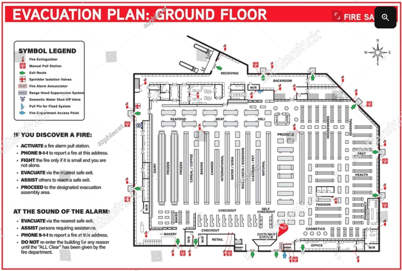
At PMU Québec, I now produce evacuation plans — technical drawings where every line, label, and legend has to carry meaning under pressure. Precision is not a stylistic preference there; it's a requirement. That discipline carries directly into my branding, editorial, and identity work.
I trained formally through three complementary programs: a DEP in Graphic Design at CBG Sorel-Tracy, a DEC in Project Management & Graphic Communication at Ahuntsic College, and an AEC in Graphic & Web Design at John Abbott College. Each one added a different layer — craft, process, then the digital and strategic dimension.
Today I work as a graphic designer, take on freelance projects on the side, and continue building a body of work rooted in real production thinking. I'd rather make work that holds up on press than work that only photographs well on a feed.
PMU Québec
Production of technical evacuation plans — drafting, symbol systems, plan layouts, and graphic output for printed safety signage in collaboration with fire safety and project teams.
Production JG
Design and pre-press for production-oriented print work. File preparation, layout systems, and on-brand visual output.
Imprimerie Paragraph
Coordination of print projects from intake to delivery. Hands-on involvement with paper, ink, registration, and press realities — the foundation of my design instinct.
Various roles
Production-floor experience across the print industry — where design either works or it doesn't.
John Abbott College
Digital methods, web fundamentals, and contemporary visual communication.
Ahuntsic College
Strategy, production workflow, and the management side of design — how projects actually get made.
CBG Sorel-Tracy
Foundational training in design craft, typography, and the discipline of layout.
A working archive of design work, technical layouts, academic projects, and freelance concepts. Some projects shipped, some were not selected — all of them shaped how I think, build, and communicate visually.
.png)


A body of academic work produced during my DEP, DEC, and AEC programs — typographic studies, editorial layouts, identity exercises, and structured grid work.
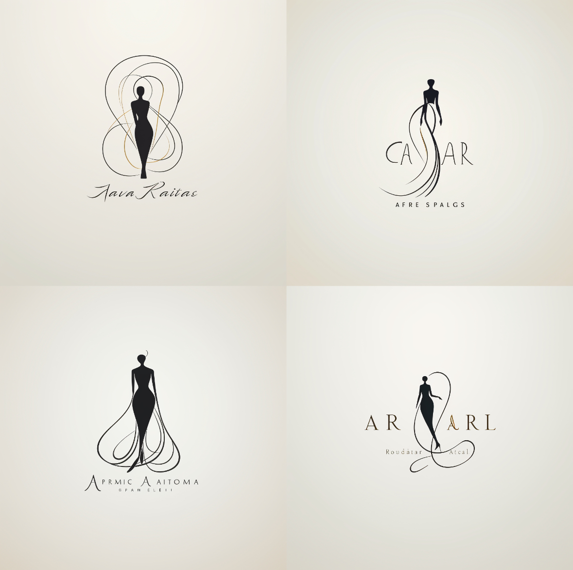
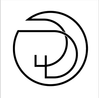
Identity work — wordmarks, monograms, and the systems around them. My approach starts with the typographic structure and works outward toward color, signage, and application.
Ongoing technical design work: floor-plan drafting, evacuation routes, symbol systems, and code-compliant signage layouts. Every plan is a working document — it has to be legible under stress, in poor lighting, and across different print sizes.
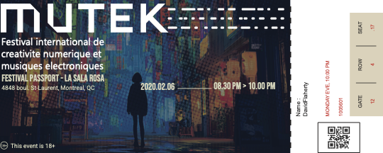
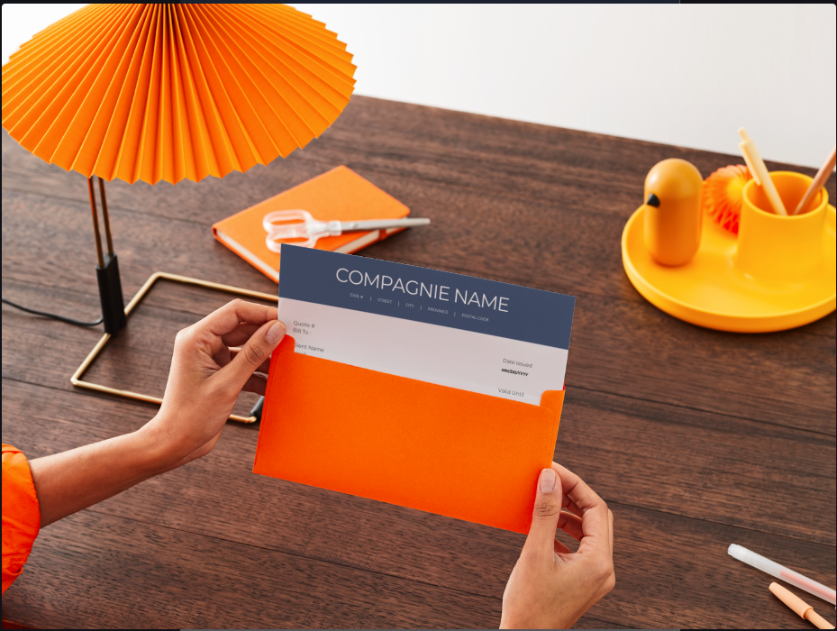
Production-grade print files: brochures, posters, business stationery. Built with the press in mind — bleeds, color profiles, registration, and the discipline of files that run cleanly the first time.
Independent client work outside my employer. Small businesses, local services, identity refreshes. The scope is modest by design — the goal is to ship work that actually gets used.
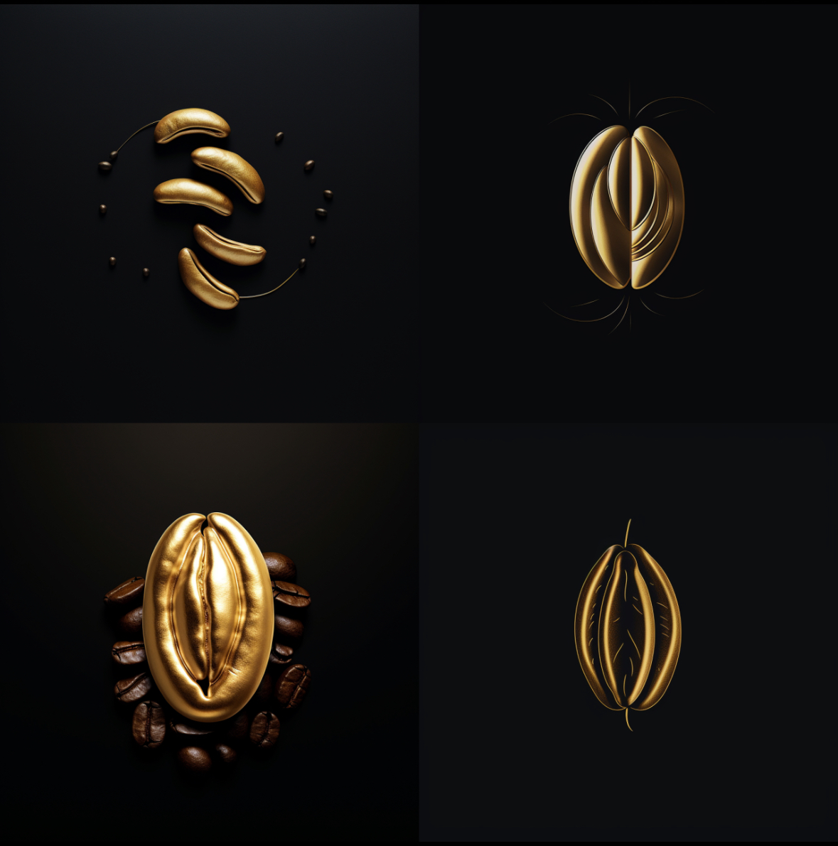
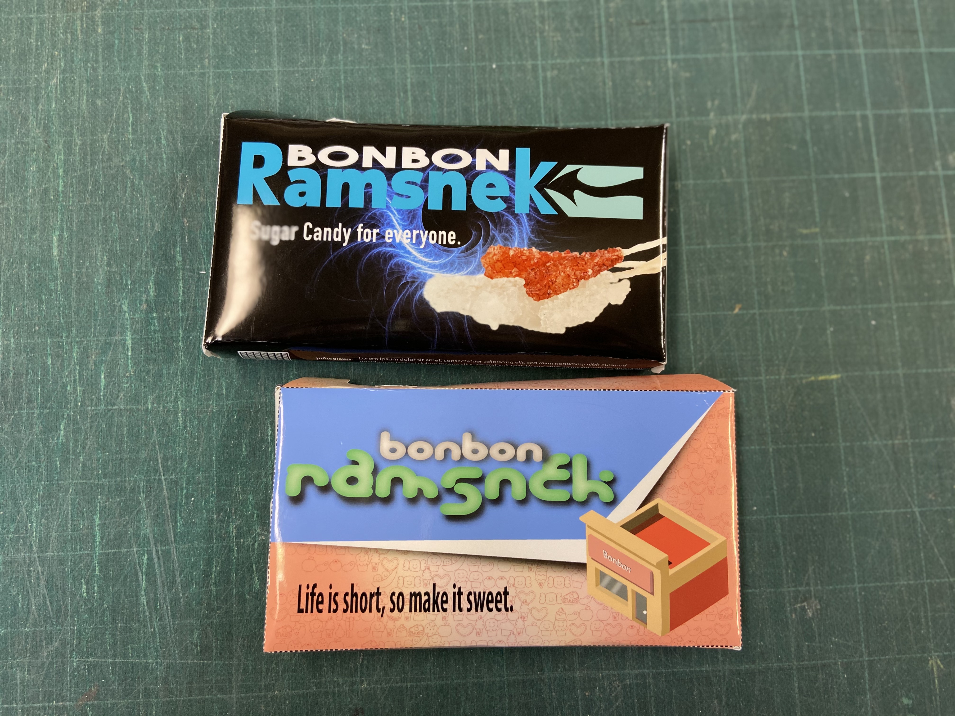
Not every project ships. These are real concepts that clients did not select, presented honestly — because the reasoning behind a "no" usually teaches more than a "yes."
Client need. A small restaurant looking for a complete visual identity with a modern but warm character.
Concept direction. A refined typographic logotype paired with a custom monogram and a muted earth-tone palette.
What worked. The typographic system was strong and the print applications held together cleanly.
Why it was not selected. The client chose a more illustrative, character-driven proposal. They wanted personality on the page; I delivered structure.
What I learned. A correct answer is not always the chosen one. What a client emotionally responds to matters as much as the underlying design logic.
How it improved my process. I now lead with mood boards and visual references earlier in the conversation — before the typography starts moving.
Client need. A small nonprofit wanted to refresh a dated identity while keeping existing supporters comfortable.
Concept direction. A clean restructuring of the existing mark — same shape, modernized proportions, refined color.
What worked. Continuity. Donors would have recognized the brand instantly, and the system was production-ready.
Why it was not selected. The board wanted a bolder break from the past. They felt the proposal was too quiet for the moment.
What I learned. "Refresh" can mean very different things. Some clients want evolution, others want a flag in the ground.
How it improved my process. I now ask explicitly how far the client is willing to move from where they are.
Client need. A local service provider needed a full identity and basic print package on a tight timeline.
Concept direction. A geometric monogram with a strict sans-serif system, focused on legibility on vehicles and signage.
What worked. The mark performed well at small sizes and in single-color print.
Why it was not selected. The client pivoted their offering halfway through. The original brief no longer matched the new business model.
What I learned. A brief is a snapshot of a moment. Building flexibility into the system from the start is more valuable than perfecting the first idea.
How it improved my process. I now design identity systems with at least one secondary configuration in mind — so the brand can flex without being rebuilt.
If you're looking for design that holds up in production — reach out.
digidesign73@gmail.com