Self-Directed Concept Case Study · Brand Identity · Packaging · Web
Zayara — Full Creative Suite
A complete brand identity, investor pitch deck, brand guidelines, product mockups, and four coded website layouts for a premium skincare concept — designed as one coherent visual system.
Overview & my role
Zayara is a self-directed concept case study created to explore how a premium skincare brand can hold together across identity, packaging, investor materials, and web design.
"Zayara — Ancient Roots · Modern Science" is a concept for a Moroccan-heritage skincare line pairing argan oil, rose hip, and prickly pear with clinically dosed actives across three product lines: Origine, Aktif, and Fusion. I developed the identity, investor pitch deck, brand guidelines, product mockups, and four coded website layouts as a single end-to-end creative suite.
- Develop a logomark, wordmark, and three colourway variants (dark, light, gold) across the full product range.
- Build a 7-page brand guidelines document — essence, logo system, colour palette, typography, imagery direction, copy examples.
- Produce a 9-slide investor pitch deck with market sizing, go-to-market strategy, and financial projections.
- Render product mockup scenes for the full line, and code four distinct website layout directions.
- Document the system so visual decisions can carry clearly across print, presentation, and digital touchpoints.
Project phases
-
Phase 1
Brand Identity System Built
Logo, palette, typography
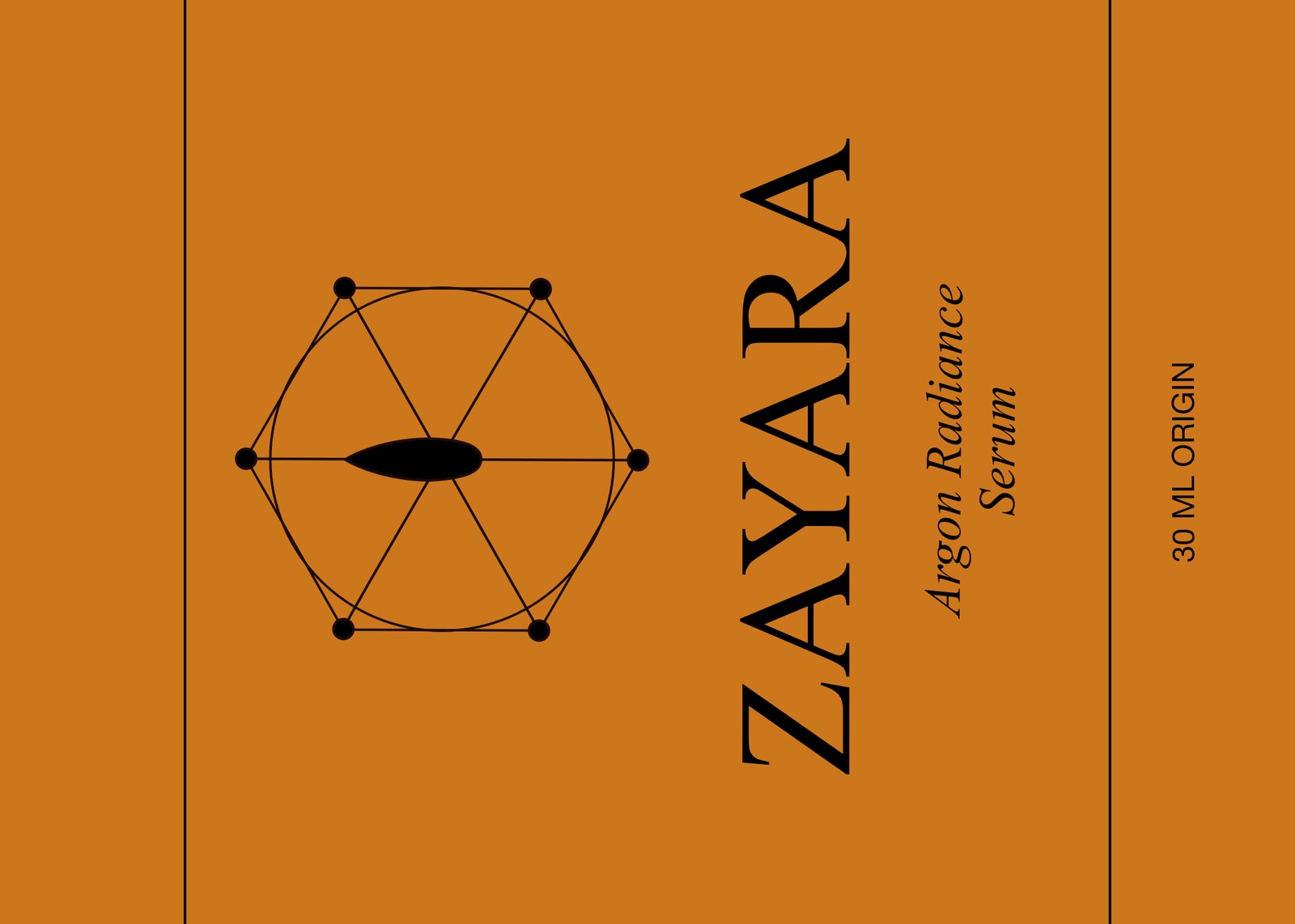
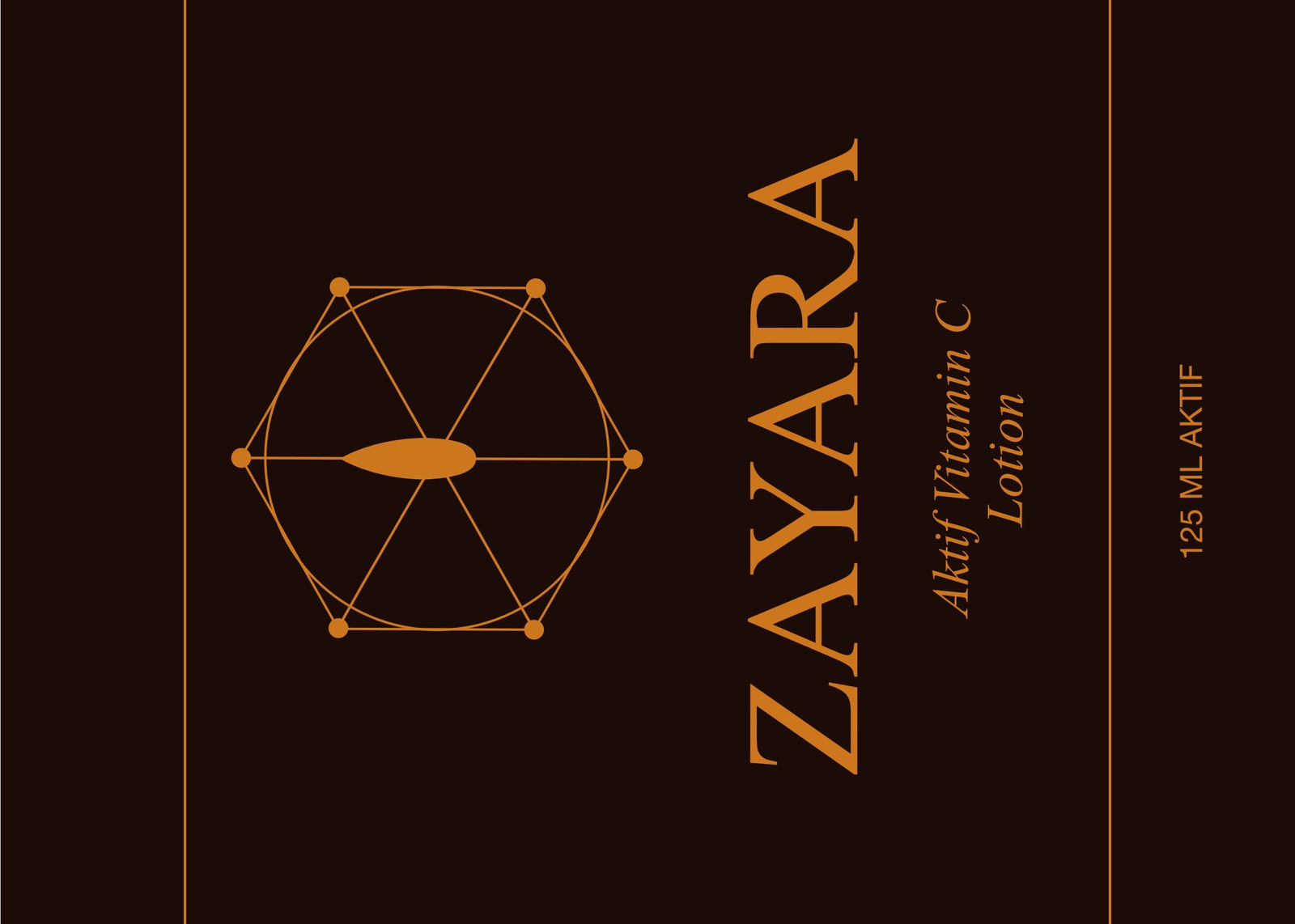
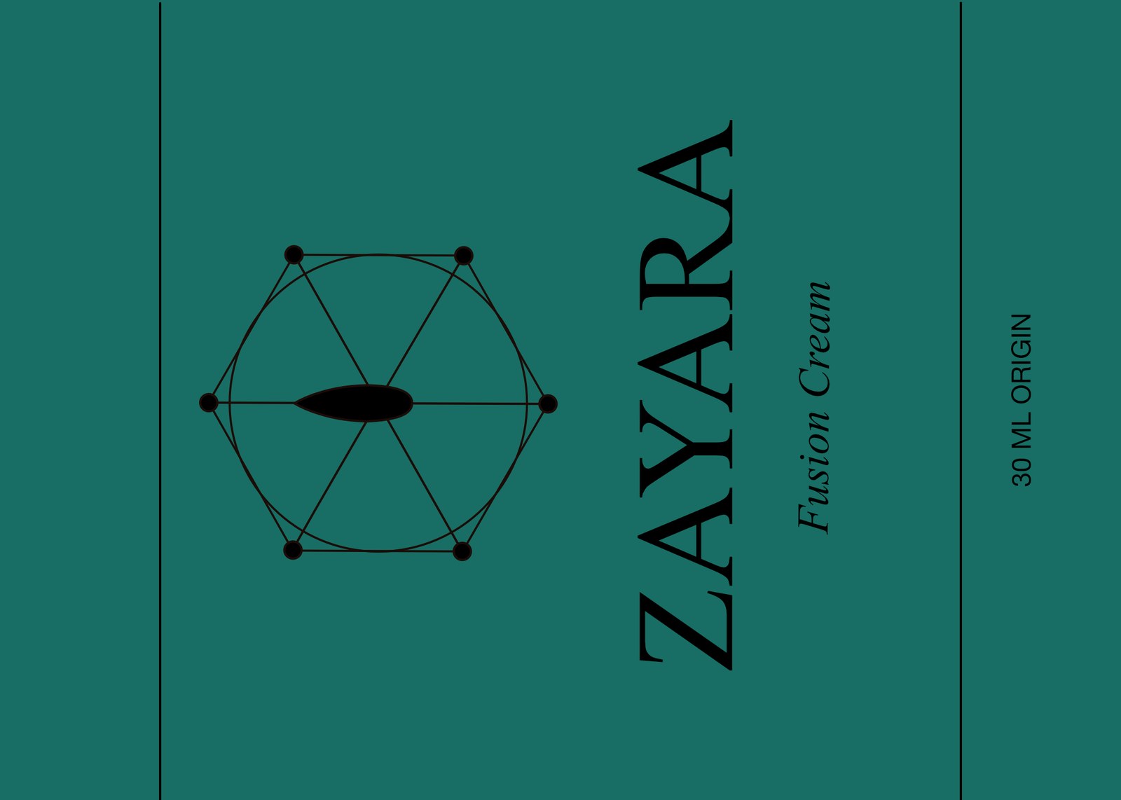
A Moroccan star-lattice logomark with an oil-drop centre, a Cinzel wordmark lockup, and three approved colourways — Desert Ink (dark), Sahara Sand (light), and Argan Gold (accent) — applied across three product-line labels.
-
Phase 2
Guidelines, Pitch Deck & Mockups Built
Full documentation set
A 7-page print-ready brand guidelines PDF, a 9-slide investor pitch deck with market sizing and financial projections, and product mockup scenes covering the full Origine/Aktif/Fusion range.
-
Phase 3
Website Layout Directions Built
Four coded directions
Four distinct HTML/CSS layout concepts for the Zayara e-commerce site, from a minimal editorial direction to a warmer apothecary-style layout, each carrying the full identity system.
-
Phase 4
System Presentation Documented
Cross-channel design system
A documented creative suite showing how the identity carries across packaging, presentation materials, product visuals, and digital layouts.
Design brief
- A premium, heritage-meets-science skincare identity — "ancient roots, modern science" as the core tension to resolve visually.
- A believable, launch-ready brand across every touchpoint: identity, guidelines, pitch materials, product visuals, and a website.
- A name and story that could support a wide product range across multiple lines and price points.
Design challenge: Create a credible premium identity that balances Moroccan heritage and modern clinical science, then carry it consistently through labels, presentation material, product visualization, and a responsive web direction.
Brand identity & label system
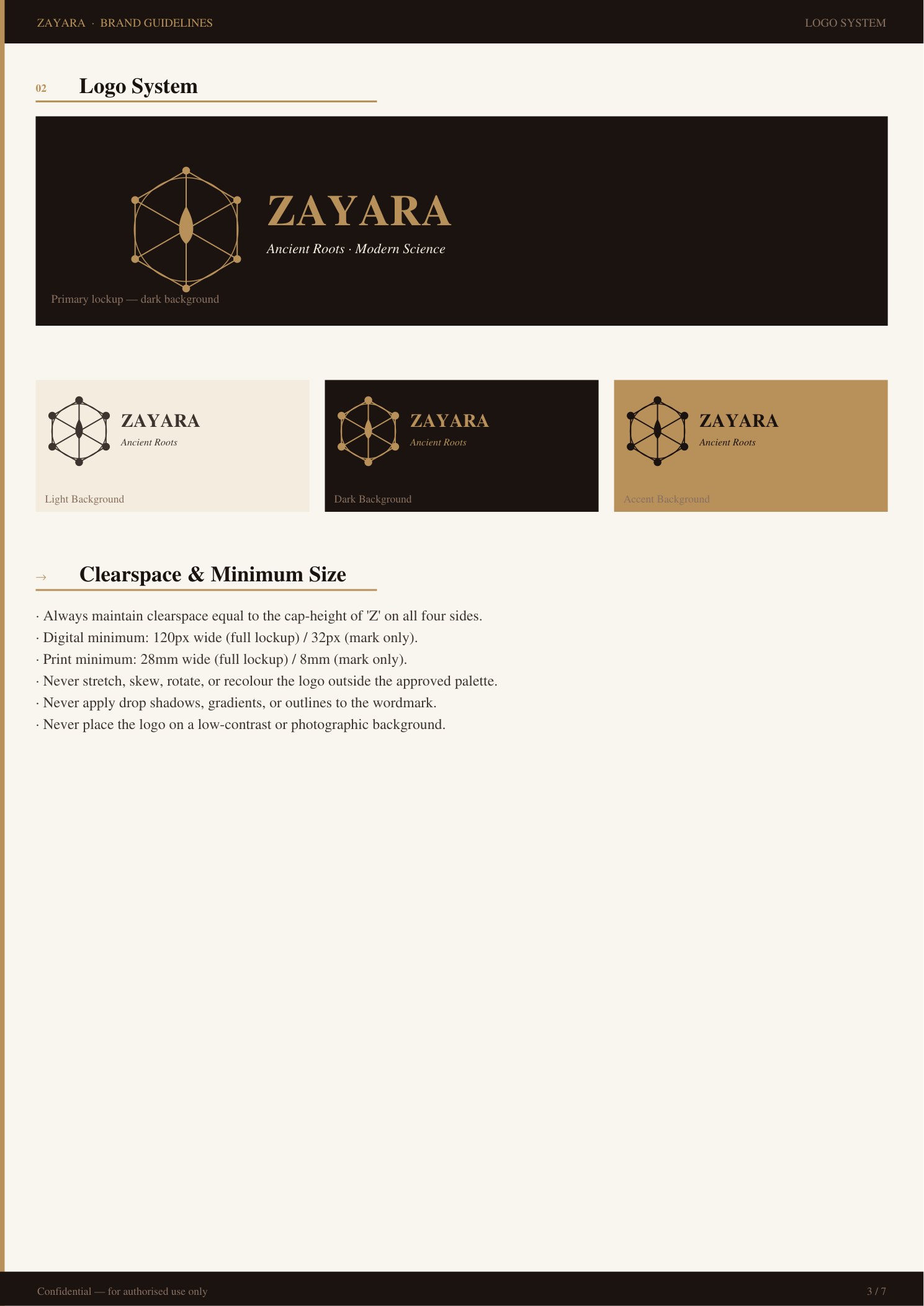
The logomark — a Moroccan six-point star lattice with an oil-drop centrepiece — carried across three approved colourways, one per product line: Origine in Argan Gold, Aktif in Desert Ink, Fusion in a deep Atlas teal.
Brand guidelines
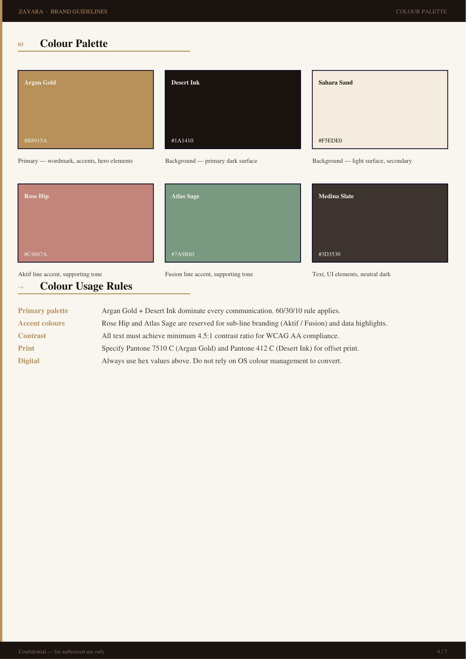
The 7-page guidelines document specified the logo system, clearspace rules, the six-colour palette with Pantone and print values, and a three-font type hierarchy — everything a downstream printer, developer, or second designer would need without asking.
Website layout & product mockups
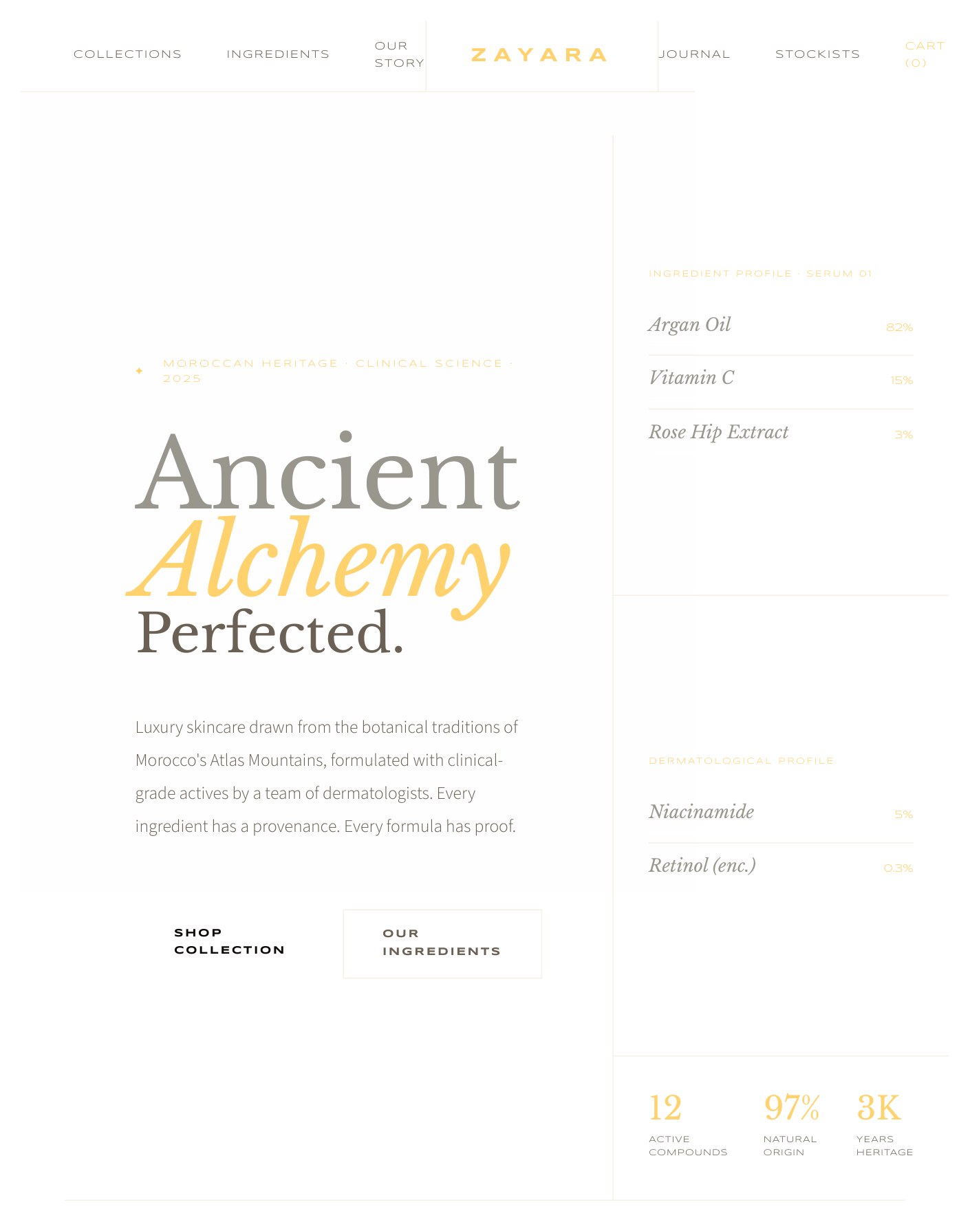
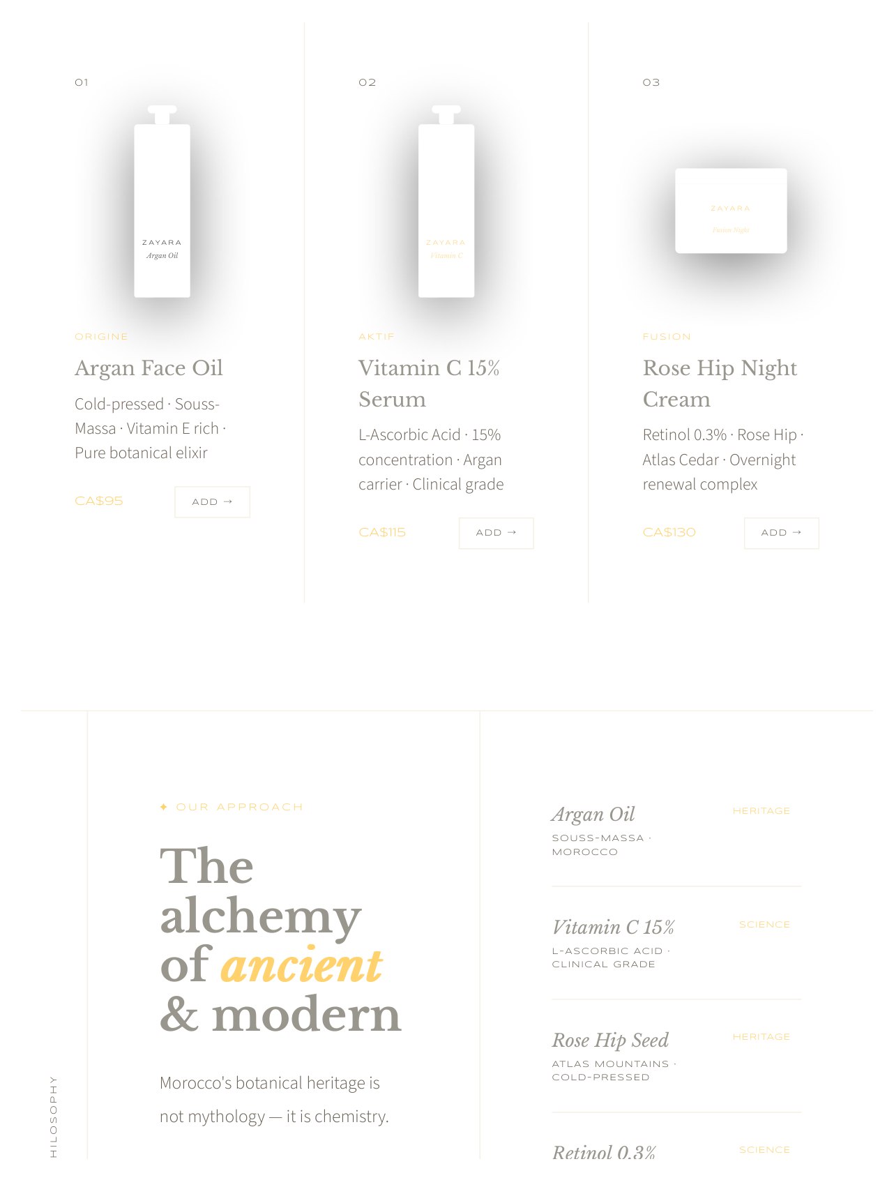
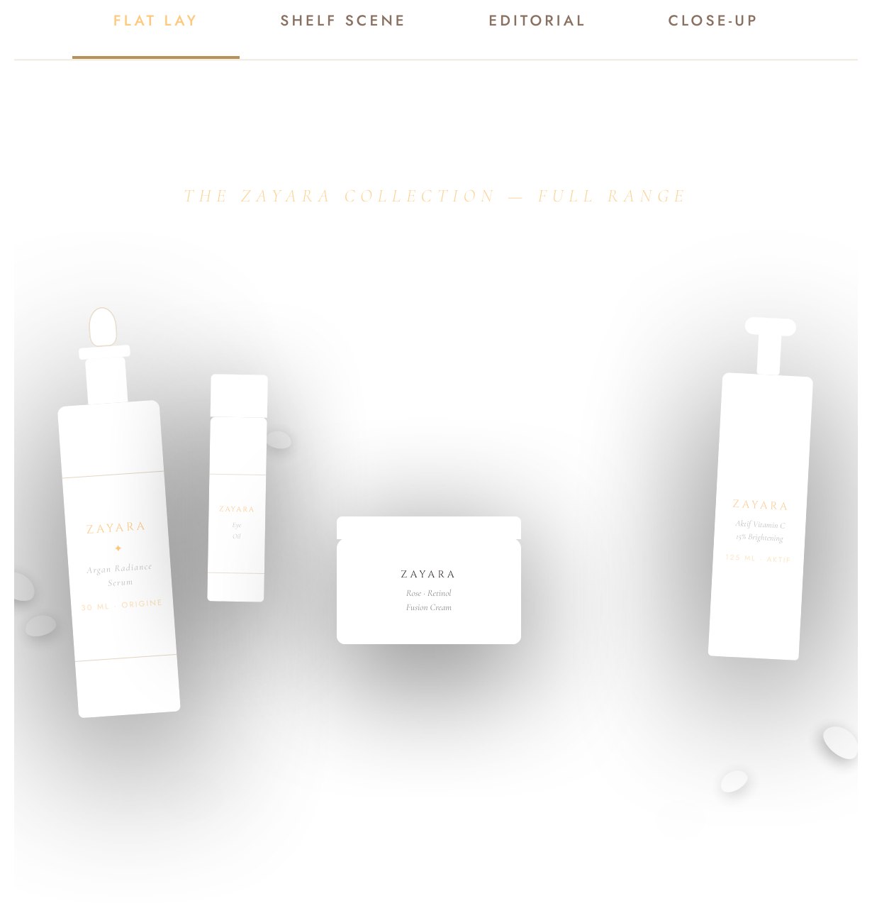
One of four coded layout directions — an apothecary-inspired editorial approach — plus a flat-lay mockup scene from the product visualization set, all rendered in pure HTML/CSS rather than photographed.
System thinking
Zayara was designed as more than a logo exercise. The same visual logic carries from the mark and label hierarchy into guidelines, presentation materials, product scenes, and a responsive website direction.
- One visual language across touchpoints. Typography, colour, spacing, and imagery are designed to feel connected whether they appear on packaging, a deck, or a screen.
- Production-aware details. The guidelines include clearspace, colour, and type rules that help a printer, developer, or future collaborator use the system consistently.
- Digital direction with purpose. The HTML/CSS layouts translate the brand into a clear product and content hierarchy rather than treating the website as a separate visual exercise.
What this case demonstrates
A. End-to-end visual consistency
This case demonstrates the ability to develop and maintain a coherent visual system across identity, packaging, presentation materials, product visualization, and web layouts.
B. Practical production thinking
The work is structured to be understood and extended by downstream collaborators, with visual rules and deliverables that support real production rather than a one-off presentation image.
Need a full brand system built right the first time?
Identity, guidelines, pitch materials, product visuals, and a coded website — scoped to your actual budget and timeline from the first conversation. Let's talk.